Last-Minute Update

After uploading more content, tweaking each individual assignment and making the suggested changes to my individual project, my portfolio and final are complete. Or rather, they are as complete as they’re going to be before this summer when I attack “Transatlantic Encounters” all over again. While I’m looking forward to getting my hands dirty with Omeka and PHP programming, I am so grateful that I had this semester to familiarize myself with CSS3 and Dreamweaver. It has really illuminated what can be done with some simple styling (and without resorting to jQuery). I am also grateful to you all for your help, constructive criticism and camaraderie. As next week may be the last time I’m ever in Fairfax, I want to wish everyone good luck with their scholarship. We’ll always have the hashtag!

This week I commented on Steph’s updated project.

Leave a Comment

Prelude to a Final

My preliminary final project is up and running. Any feedback is more than welcome. There are a couple of pages yet to be completed, my gallery map still needs informative text, and a number of my images need restoration. But for now, I’m happy with the direction the site is going in.

You’ll notice that the “Search” pages link to an Omeka project. This will be the focus of my summer internship project, during which I’ll be working with my adviser, Prof. Michele Greet, and another student to digitize research that she won’t have room for in her current book. For the purposes of this course, like Celeste, I was more interested in honing my hand-coding skills than juggling multiple content-management systems. Thus, I decided to install Omeka but reserve its full development for the summer.

One major challenge that I continue to struggle with has been the Google map of Paris galleries. I am very much a JavaScript novice and haven’t had to work with it at all since undergrad, so the Google Maps API was both enlightening and frustrating. Ideally, I want a user to be able to click on a map marker and trigger a hidden DIV to open outside of the map, presenting more details about each gallery. I get the sense that this isn’t possible. I’ve been able to accomplish the opposite, in which clicking on a gallery name outside of the map will open its corresponding map marker, but I scrapped the idea since it would be useless for those who arrive knowing nothing about the galleries. At this point, I’m just planning to add a short description or interesting information to each info bubble. But if anyone has any better ideas, I’m all ears!

The image gallery was also a bit of a challenge, and I am envious of Maggie’s JavaScript solution. I stuck with CSS because I was so weary of JavaScript after the map experience, but there are obvious challenges to how much a user can interact with CSS.

In any case, being able to see the cumulative effect of our assignments from this semester has been really satisfying (both in my project and others). If anyone can offer some constructive criticism before class tonight, I would really appreciate it.

Leave a Comment

Design Critique: The Chemical Warfare Debate

Kudos to Chris for focusing his design assignment and final on the fascinating (and terrifying) topic of “the lack of consensus on chemical weapons in the interwar period.” Here are my thoughts on his design thus far:

CARP Evaluation:

  • Consistency: The style and layout of the page is generally consistent, although the gray hover color in the nav bar seems a bit out of place since the color is not repeated elsewhere. This could be a good opportunity to use more of the dark red.
  • Alignment: The text on the page is justified beneath a centered H1, while image captions are centered. I tend to think that aligning the content to the left might add some dynamism as visitors scroll through the page, since the full rectangular blocks of text can appear a bit daunting. The footnote citing Kellie Bradshaw’s site is also placed a bit awkwardly and might benefit from being placed inside the content div.
  • Repetition: Chris is consistent in his repetition of the dark red and mustard color scheme, with the footer mimicking the header. Considering how much text is on the page, it might be useful to include more of the red as a decorative element somewhere in between the two divs (or in the nav bar during hover, as I mentioned above).
  • Proximity: I think the page would really benefit from some added padding and space. There is little room especially between the first paragraph and the nav bar and image. Adding width to the container and a little padding to each of the divs might open up the page and mirror the spread of the figures in the header image nicely. The heading font also seems to be piling up on itself; maybe this is a line-height issue? I might also remove some of the space between the final image and the navigational links.

Other thoughts:

  • I like the colors, perhaps in part because mustard makes me think mustard gas. Even though they may be unconventional for a war subject, they seem to work. On the other hand, the mustard isn’t quite the shade of yellow in the header image. I think using actual tones from the image would really benefit the page in terms of consistency. I’m also not sure about the white body background; it tends to dominate when the container width is as small as it is. Perhaps another color from the header could be used?
  • The scholarly-looking serif used for the body text is beautiful and relatively neutral, but the Italic type used for the heading and drop-caps contains flourishes that seem to contradict the time period and subject of this project. I think this is a place where you can really depart from Kellie’s layout and experiment with some interesting fonts that denote war/violence/propaganda, etc. (It is great that she is cited at the bottom, though.

Overall, I think the design complements this difficult topic nicely, and I’m looking forward to learning more about the debate in Chris’s final.

Leave a Comment

Design Up and Running

Resisting the urge to nitpick for the next 8 hours: my design assignment is live.

Comments (1)

Design Progress

As many of my thoughts on this week’s encounters with interactivity have been covered by my classmates, I thought it would be a useful exercise for me to discuss my recent progress with the design assignment and individual project, which has been aided immensely by our last few classes as well as reviewing several Lynda.com tutorials from earlier in the semester.

For my design project, still very much a work in progress, I am sticking with the historical moment of my final project: 1920s-30s Paris. During this decade, a clean, geometric art deco style emerged out of the far more ornamental art nouveau. The two tendencies are clearly visible in architecture, painting and prints from the time, so I should have plenty of visual material to choose from. But working with such an iconic aesthetic is problematic. Though the Latin American artists I focus on were largely upper-middle class and participated with Europeans in all forms of artistic activity and discourse, they were still frequently marginalized and forced to tailor their work to preconceived cultural stereotypes, ultimately resulting in their exclusion from the art historical canon. My project is not about one style or theory dominating the rest — it’s about cross-cultural collaboration. So my challenge will be to design a Parisan theme that still emphasizes this international milieu.

One source of inspiration for my design assignment.

I’ve started by exploring exhibition brochures and posters from the time. Gallery publications during this period tended toward the art deco aesthetic, whether or not the art they exhibited did. One poster I’ve been working with advertises the 1925 International Exposition of Decorative Arts (left).

Though I am still working on a color scheme, this poster provided some guidance. I was also inspired by the clean, legible typeface to look for a modernist sans-serif for my headings. I landed on Catorze27 from myfonts.com (supposedly Portuguese in origin, though I’ve found similar sans-serifs used in France). I matted the central image to my background in order to carry the reddish/coral accent through the page, as well as to continue practicing working with transparent layers. The image, a modernist take on a classical theme, would have been popular in the interwar years and seemed like a perfect motif for the page.

I also experimented with the poster’s decorative borders. With the help of Lynda, some Googling and the fantastic code-generator at border-image.com, I applied the border-image property to my page. I ran into problems with this property’s compatibility with IE and ended up instead applying what we learned about “position: absolute” last class to fixing my border images around my container, with these results:

My page with border-image applied.

While I like the border in theory, I’m worried that this one conflicts with the geometric order of my type and layout, so for now I’ve removed it. I hope to apply the motif to some other element within the page and would appreciate any thoughts or suggestions from the class.

The other adventure in new media I’ve had recently was my introduction to Omeka. As a Clio novice, between navigating the BlueHost control panel and making sure the right “.htaccess” files were in place, installing the scripts was extremely time consuming. But I am thrilled to have the groundwork done. With Joshua Brown’s call for digital history that opens itself up to interpretation in mind, I am looking forward to digitizing evidence of the Latin American presence in Paris and allowing readers to reach their own conclusions about this moment in history.

Leave a Comment

Road Blocks to Creativity

Image

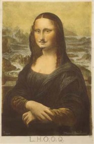
"LHOOQ" by Marcel Duchamp: a 1919 remix of everyone's favorite portrait.

After watching Lawrence Lessig’s TED Talk, “How Creativity Is Being Strangled,” I was struck by the parallels between the remixing culture that Lessig hopes to redeem and the kind of selective interpreting we perform as (art) historians. As David points out, what we do in our scholarship is in many ways analogous to the visual/audio mash-ups that circulate user generated content sites like Flickr, Youtube and Tumblr. As art history has moved further and further beyond traditional formalist and connoisseurial modes of interpretation, it has taken on the form of a constant re-sorting/re-reading of visual signs and social context. (While not “amateurish,” our work even fits Lessig’s definition of amateur: no one’s in it for the money.)

So I appreciated Lessig’s argument for the revival of “read-write culture” through opening up the public domain to fair use (Hans Rosling’s TED Talk touched up on this as well, though less directly). In gathering images to use for our various assignments, I’ve been frustrated by the licensing road blocks along the way, especially considering the lack of exposure that my topic has had within the field. I’m sure scholars publishing costly books must feel exponentially more frustrated. While I found Lessig’s call for competition within the UCG market compelling, it seemed to hinge on artists and authors being willing to volunteer their work for non-commercial work. Based on my experience working with collections that include work by living artists, many of whom are extremely particular about copyrights, I question the feasibility of this.

Turning to our other readings this week, I can’t help but find myself becoming skeptical of websites that purport to offer guidelines for web design and accessibility but violate basic design rules in the process. Jakob Nielsen’s “Guidelines for Visualizing Links,” not to mention his homepage, couples an unhealthy amount of Verdana with an exhausting line width. I think it’s somewhat telling that his link guidelines were written eight years ago. While I understand the functional necessity of distinguishing hyperlinks from plain text, this aspect of web design has become highly flexible over the past decade and most Internet users have evolved with it. To his credit, Nielsen’s tips do emphasize the kind of accessibility we read about last week (i.e. for older or disabled users). I continue to wonder about the compatibility of such accessible design with today’s increasingly un-intuitive but aesthetically creative design trends.

Addendum: So far, I’ve commented on Maggie’s blog.

Comments (2)

Visuals and Accessibility

NGA touch-screen interface

Tufte's rejected touch-screen interface for the National Gallery.

After reading Edward Tufte’s Visual Explanations and our assigned web reading on Internet accessibility, as an art historian I was left wondering about the feasibility of communicating visual explanations about visuals to a visually impaired audience. The book includes several graphics that deal directly with art display and information. While Tufte’s design for a National Gallery touch-screen for navigating the museum (a strategy that he notes has since been somewhat displaced by technology like the iPhone) struck me as adaptable to a three-dimensional interface for the blind, I wondered about the galleries themselves. How can the design of physical and online exhibitions best translate the aesthetic experience of an art museum through the other senses?

I had actually been wondering about this question prior to our readings, when a professor on the Association of Latin American Art listserv asked about how best to accommodate a visually-impared student. Through some cursory Googling, I happened upon Art Education for the Blind, a non-profit that seeks to make aesthetic experiences available to the blind through touch and sound. This can entail:

  • In-depth audio narratives
  • Atmospheric sound compositions that approximate visual concepts like space and emotion
  • Tactile diagrams that allow visitors to feel aspects of an art work like line and brushstroke through representations with raised edges
Nighthawks original and tactile diagram

"Nighthawks" by Edward Hopper, left, and its tactile representation with raised edges, right.

It turns out major museums use a number of these strategies. The Museum of Modern Art offers Braille gallery maps, tactile diagrams and models, as well as “Touch Tours” of selected objects from the collection. In terms of digital media, they have recorded detailed visual descriptions of specific works, available both online and through the on-site audio guide. This seems like the most viable strategy for a website dealing with art, since sound is (so far) the only sensory experience available through the Web aside from sight.

In terms of my own work this semester, I am becoming increasingly aware of the importance of document flow, clear coding and alt text. While attention to these elements can aid screen readers, I think it can be just as relevant for any visitor looking for clean navigation and image descriptions. (Though I attempted to take David’s suggestion and download WebAim’s Screen Reader Simulation to test my own site, I was not able to use it on my Mac, even after downloading Adobe Shockwave. Can anyone offer any tips?)

Dork Short

On a related note, the tool I recommend checking out this week is designed to increase clarity within CSS3 coding. Sass was mentioned to me by a developer friend a few weeks ago. While it may be best reserved for further post-Clio experimentation, Sass is a kind of “meta-language” that aims to improve on the structure of CSS3. One of its improvements is selector nesting–instead of having to repeat div names each time you write a selector within one of them (for example, #nav, #nav li, #nav li a, #nav li a:hover…), Sass allows you to nest “child selectors” within their “parent selectors.” It also allows you to declare variables, such as a hex code that you keep having to copy and paste, by renaming them something simpler. Basically it addresses a lot of the redundancies that have been plaguing some of our coding, and I’m excited to give it a test-drive.

Addendum: This week I commented on Rosendo’s post.

Comments (2)

Image Assignment Up and Running

I will inevitably continue tweaking this all day, but for all practical purposes, my image assignment is now live.

Addendum: I commented on Celeste’s post about her image assignment and responded to Sheri’s comment.

Comments (3)

More Photoshop Practice

This week’s articles and tutorials highlighted both the promise of Photoshop’s photo restoration features and the problems that come with it. In order to get started on the impending image assignment, I began toying with levels, color channels, patch tools and the clone stamp (not without some help from friends).

I began working with some 1920s Parisian exhibition photographs that were passed on to me by Prof. Michele Greet. Once I determine the licensing permissions, I plan to incorporate some of the images into a small gallery database for my final project. The photos work well for this assignment because many are faded and several have tears and spotting. However, finding a useful example for hand-coloring was a little more challenging, since many of my images contain artworks, which I’d like to avoid messing with for obvious reasons.

One of my attempts involved coloring a group of artists participating in a 1930 exhibition for the group Cercle et Carré (below).

I cropped the image to include only part of the group because I was most interested in the grumpy looking gentleman in the foreground. I finally managed to identify him as Joaquín Torres-García, probably the most famous South American visual artist of his time.

I began to colorize the cropped image, with mixed results. Adjusting the black and white levels created too much contrast, so I plan to play with those a bit more. I also need to experiment more with brush opacity when applying skin tones to avoid making Piet Mondrian (second row, with mustache) look like he spent too long in a tanning salon. The group portrait is probably still not an ideal subject for retroactively applying color, but the process does bring out a kind of dynamism in the image that wasn’t present before.

I also worked on restoring a 1930 photograph of the Galerie Zak, which, either through printing or poor scanning, had developed a grid of yellow dots running through the entire composition. It also had a tear in the upper right corner. (You may have to click on the first image to see the damage.)

Galerie Zak, 1930 (original)

Galerie Zak, 1930 (after restoration)

I’m pretty happy with how this one turned out. The picture was taken during the Exposition du Groupe Latino-Américain de Paris, the first group exhibition of Latin American artists in Paris. The yellow dots and tear distracted from important content: a show and a venue that have been written out of histories of modernism. In order to eliminate the dots, I created a new black and white layer and used color filters to filter them out. I then applied the patch tool and spot-healing brush to eliminate the tear in the corner and other less noticeable damage.

These exercises and others made me more comfortable working with layers and toggling between tools. I found the Lynda tutorials that dealt with identifying problems areas in old photographs especially helpful, since I initially had trouble differentiating between kinds of damage. I also found myself returning to last week’s videos in order to prepare for uploading my finished products to the web. I’m looking forward to being proficient enough in Photoshop that I can start modifying photographs in still more historically meaningful (but ethical) ways.

Comments (3)

Photoshop Ethics and Aesthetic Angst

Reading the step-by-step guides to image manipulation in Robin Williams and John Tollett’s “Non-Designer’s Photoshop Book,” as well as several thoughtful posts this week, raised a number of questions for me about the ethics of photographic enhancement. As a darkroom photographer, I’ve come to begrudgingly accept the ubiquity of digital manipulation, and even occasionally experiment with it (although I am still very much a Photoshop novice). What takes me hours to do using contrast filters, dodging and burning now takes mere seconds using the digital toolbox. But I’ve always been proud of my inevitably flawed prints, and I can’t help but wonder if, in touching up historical images to make them more legible, we risk homogenizing them to the point of devaluing the technical limitations faced by the artist, a factor that is especially important for an art historian.

In this debate, I think it’s also useful to consider the turbulent history of art conservation practice. An exhibition two years ago at the Philadelphia Museum of Art, “An Eakins Masterpiece Restored: Seeing The Gross Clinic Anew,” highlighted how the ethics of conservation has shifted over the past century. In the 1960s, conservators attempted to “restore” Eakins’ masterpiece by brightening its warm tones and illuminating figures in the background who they argued had been obscured over time. As decades passed, the practice changed, and after applying x-rays to the work and undertaking new scholarship, the museum chose to undo the restoration project, arguing that Eakins had never intended for the figures to be illuminated and the earlier conservators had intervened in the painting to its detriment.

By exhibiting this history, the PMA highlighted both the inconstancy of ethical practice in the field and its latest fad: transparency. And while an art museum will inevitably contextualize its images differently from a web designer, I think transparency is a viable solution for the latter as well. When we introduce an old photograph or print to the web environment, whether manipulated or not, it inevitably takes on new meanings, and I suppose it is the job of the digital historian to reconcile these with the original context.

I think a powerful way to begin this historical contextualization is through color, another focus of our readings this week. Now that designers are no longer limited “web-safe colors” in their graphics in design, there is far more room to experiment with color schemes. (While I didn’t realize these colors had a name, I do experience a distinctly ’90s nostalgia when I think back to the color palette of early websites.) I have continued to experiment with color in my website, with the goal of hitting upon a combination that a) hints at the scholarly content, b) interacts with my images and c) avoids exoticizing the Latin American subject matter.

Comments (2)

Older Posts »